Behind the Logo
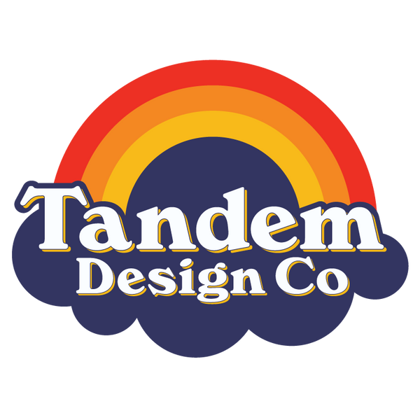
The essence of Tandem Design Co's logo is a vivid testament to our beliefs, each element carefully chosen to represent our dedication to inclusivity, accessibility, and the beauty of shared experiences.
- The Partial Rainbow: This feature is not just about aesthetics. It symbolizes our embrace of diversity and inclusion. A fun representation of the variety of experiences within our community, underscoring our belief that everyone deserves to be celebrated and included.
- Our Touch Elements: Given the importance of tactile feedback the logo incorporates Braille.
- Typeface: The typeface, with its retro, West Coast flair, injects a sense of fun and warmth into our identity. It's a nod to our origins and ethos, capturing the spirit of innovation and the laid-back, inclusive culture we cherish.
- The Sunset Motif: The a reflection of our desire to share beautiful, awe-inspiring moments with one another.
- Our Cloud: Representing ideas as boundless as sticky notes floating in the sky, the cloud element also acknowledges the challenges faced by our visually impaired community. It's a balance of optimism and realism, recognizing the hurdles while celebrating a future we cannot see.
Through these elements, Tandem Design Co's logo tells a story of a world reimagined—more colorful, inclusive, and empathetic, inviting everyone to be part of this journey.